Evolving Food Home for discovery at scale
USER EXPERIENCE
GrabFood: Day X
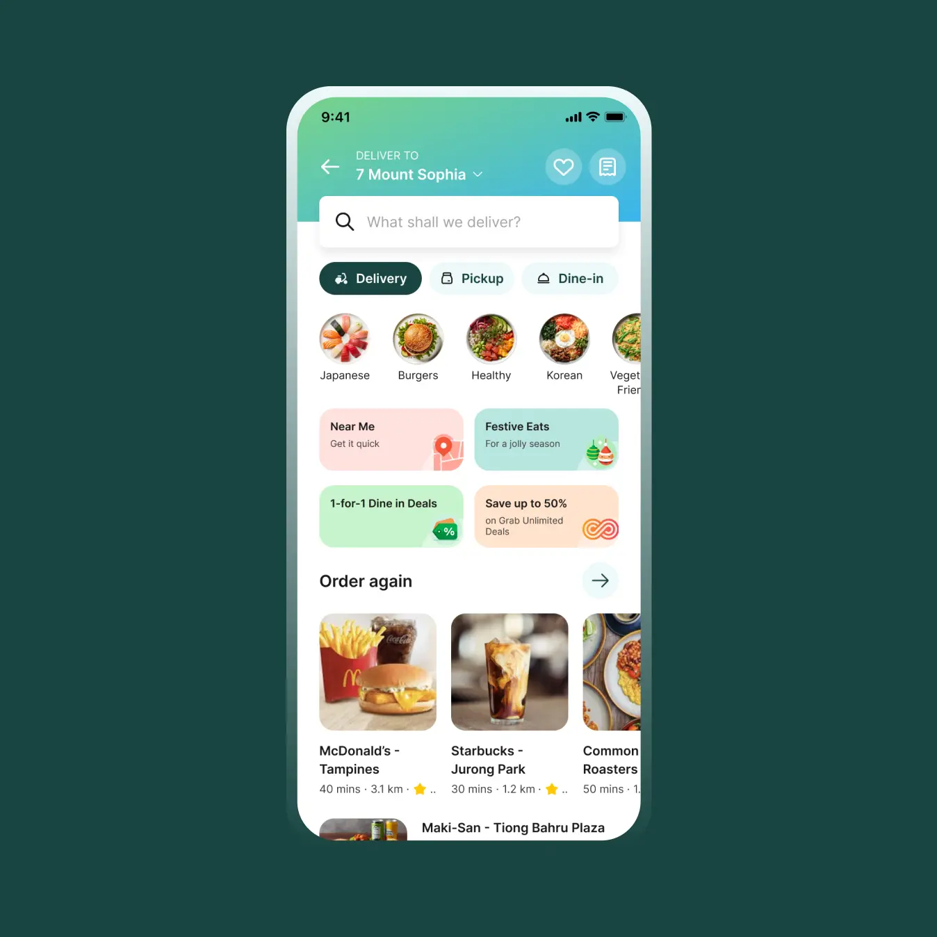
Grab Food Home
A year and a half after the first Food Home redesign, we revisited the homepage to explore how it could better support discovery while giving campaigns and personalised experiences more room to scale.
Revamping the food discovery journey for users, Grab Food undertook a home page redesign to optimize browsing efficiency.
Revamping the food discovery journey for users, Grab Food undertook a home page redesign to optimize browsing efficiency.
IMPACT
+10% tile click-through rate
+4% tile view-to-checkout rate
+3.7% tile checkout sessions
ROLES
Lead Designer
User Research
YEAR
2025
Two opportunities emerged
The first redesign established a new foundation for Food Home: making discovery more accessible while helping users quickly find something relevant to them.
As the homepage evolved, however, two areas started to need more attention.
Campaigns needed a more scalable surface
Super Header had become an important entry point for campaigns, but campaign content varied significantly across markets and use cases. We needed a system that could give campaigns stronger visibility without becoming a one-off solution for each market.
Discovery needed more room to breathe
The existing widget system gave country teams flexibility, but the 8-tile structure spread discovery across two separate sections of the homepage. The second set of tiles sat much further down the page, making it harder for users to naturally explore the full set.

Evolving the Super Header
Campaigns needed a more scalable system
I partnered with the DNA/Offers Designer to evolve the simple header into a Superheader—a flexible campaign surface that could work within the Food homepage and scale across different markets and content.
Together, we defined the interaction and visual direction, while I focused on how the component would behave as part of the broader homepage experience.


The system was supported by lightweight guidelines covering content, imagery, sizing and usage — giving local teams enough flexibility to create campaigns while maintaining a consistent experience.
Using AI tools to generate delicious cuisine images to be displayed across all different regions on the Grab Food Home page.
Making discovery easier to explore
The existing homepage used 8 country-owned widgets, with product controlling part of the experience and the remaining space left to local teams. The second set of widgets appeared much further down the page.
For Day X, I wanted to bring these experiences together into one continuous discovery surface.
Instead of asking users to decide whether to keep scrolling down or go back to something they had already seen, the new Visual Tiles became a single horizontal loop.


(Left) Existing widget experience separated by a 2-3 scrolls. (Right) New Visual Tiles: One tile is always in focus, growing slightly as users scroll through the carousel. Haptic feedback adds another layer of response as users move between experiences.
Using AI tools to generate delicious cuisine images to be displayed across all different regions on the Grab Food Home page.
Putting it to the test
Once I had a direction, I wanted to know whether it was actually better, not just newer. We ran a Maze study with 31 participants, comparing the existing icon-led tiles against photo-led versions. About three in four chose a photo-led direction. They said it felt clearer, more efficient and more relatable.
The bigger question was the single loop. In the old layout, only the top 4 tiles got real attention, and the other 4 were rarely seen. Once we combined them, tile click-through rose 10%, and the lower tiles gained the most. Checkout sessions grew by about 3.7%, so the net result was positive.
From components to a scalable system
The Visual Tiles weren't designed as a one-off homepage treatment.
I worked to define how the component could be populated and maintained across markets — including content, imagery, asset sizing, ranking and visual treatment.
Designing for 6 markets at once
Visual Tiles had to work across six markets, and the homepage wasn't entirely ours. Country teams owned much of the content, and tile performance varied a lot from market to market.
So I treated the constraints as the brief. I set clear rules local teams could follow without a designer in the room: headline and description length limits, a standard 1:1 transparent image format, and a small file size so the carousel stays fast. Local teams keep their flexibility, and the experience stays consistent.

A homepage built for discovery
The first Food Home redesign established a new foundation for the experience. Day X was an opportunity to revisit that foundation as the product became more complex.
By evolving Super Header into a scalable campaign surface and rethinking widgets as a continuous Visual Tile experience, we created more space for users to discover, explore and move through Food Home naturally.


Scaling the components for different segments: Travellers, Affordability, Premium users to create a meaningful food homepage experience.
Using AI tools to generate delicious cuisine images to be displayed across all different regions on the Grab Food Home page.
Where it landed
After the experiment, Visual Tiles rolled out across the region. The carousel made the lower tiles discoverable, lifted food conversion, and gave the homepage back vertical space for everything beneath it.
see all projects

GrabFood MenuUser Experience
Grab Food HomeUser Experience

SideChef GroceryEnd-To-End Product

Okay ReadsPersonal Project

SideChef Meal PlannerEnd-to-End Product

SideChef 4.0 Brand IdentityBrand and Identity
Mouu CliqUser Experience

Ambi ClimateUser Experience