DISCOVERY • DECISION MAKING
USER EXPERIENCE
GrabFood Menu
Grab Food Home
Reimagined the GrabFood menu experience to help customers discover food faster and make more confident ordering decisions.
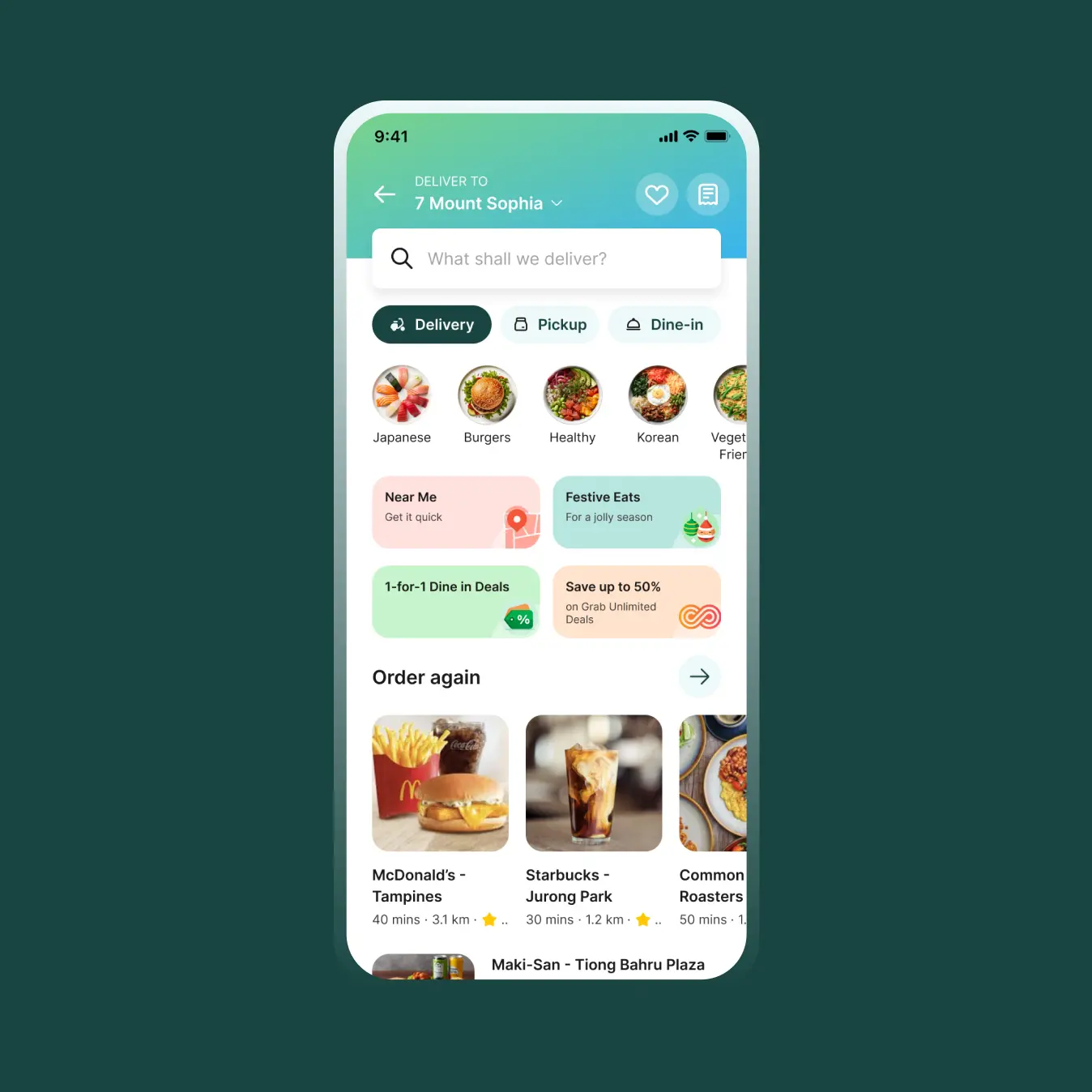
Revamping the food discovery journey for users, Grab Food undertook a home page redesign to optimize browsing efficiency.
Revamping the food discovery journey for users, Grab Food undertook a home page redesign to optimize browsing efficiency.
ROLES
Design Lead
Experience Strategy
Cross-functional Leadership
YEAR
2024

The restaurant menu is one of the highest traffic surfaces in GrabFood. It's where customers decide how they'd like to receive their order, evaluate promotions, browse available dishes, customize items, and ultimately decide whether to place an order.
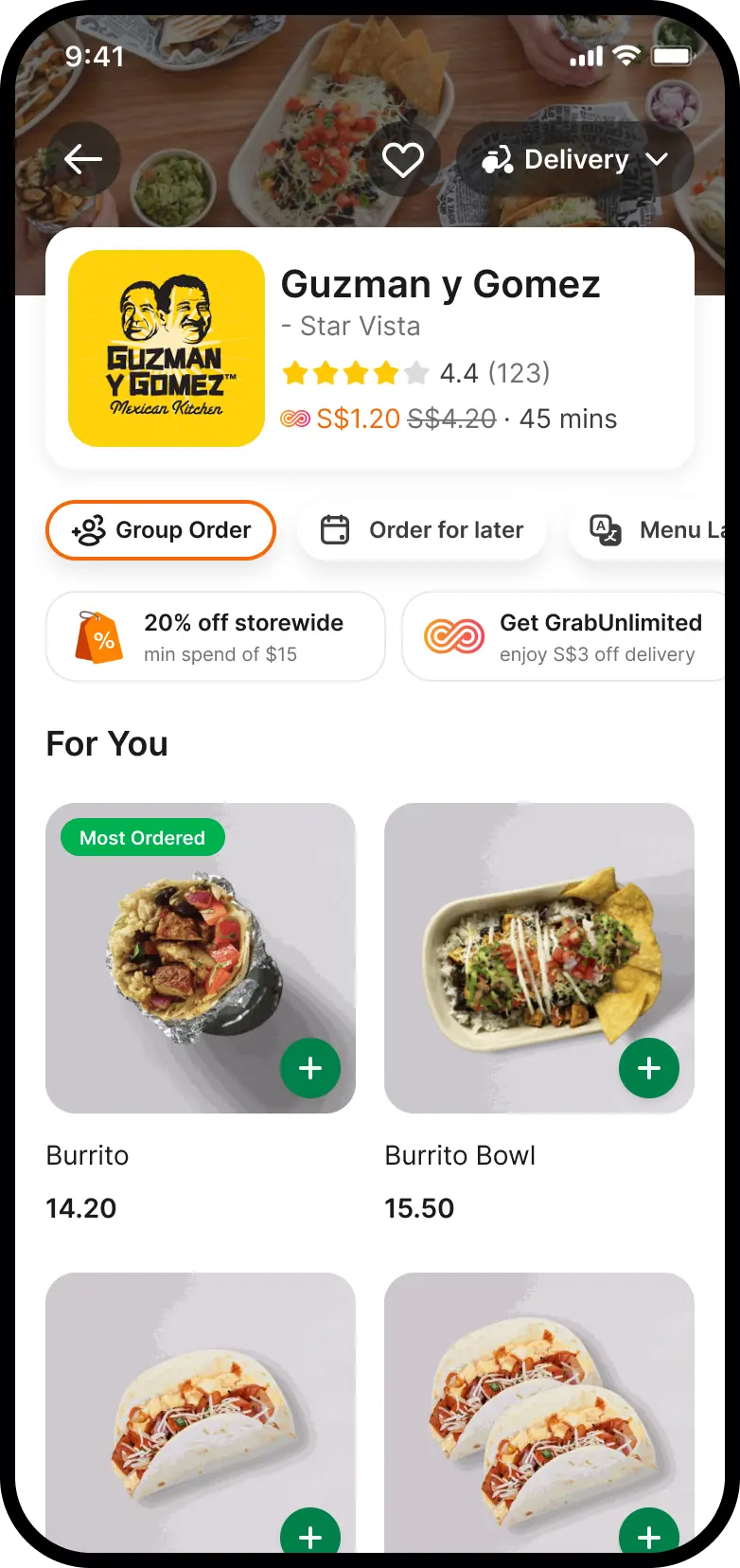
As GrabFood evolved, this page gradually became home to an increasing number of product experiences. Pickup, Dine Out, Group Order, GrabUnlimited, promotions, menu translation, restaurant information, and other features all competed for visibility within the same limited space.
While each initiative solved an individual business need, the overall experience had become fragmented. Customers often had to scroll before seeing food, making it harder to understand what a restaurant offered and slowing the path to basket.
The challenge wasn't simply redesigning a page—it was creating a flexible framework that balanced customer needs, business priorities, and future product growth.
01 Consistency
Customers have already chosen to explore a restaurant. The menu should quickly reinforce that decision by surfacing familiar information and helping them find food without unnecessary friction.
02 Prioritizing Basket Building
The menu's primary purpose is to help customers discover food and build their basket. Limited screen space should prioritize elements that move customers toward ordering.e available promos in menu.
03 Surface customer value
Make promotions, memberships, and affordability benefits easy to discover so customers can make more informed purchasing decisions.
Reimagining the Desion Making Experience:
When reviewing the experience, one insight became immediately clear – when users are deciding on a merchant, their key question is "What am I going to eat?"
With over 40% of items being clicked are the top 10 items that surface on the page, but only 2 can be shown in the current design. The merchant details section takes up nearly 60% of the overall screen making and is underutilized causing a high number of users to drop-off.
We followed these three principles to ensure we had a north star during the design process and to ensure that every single asset (which is owned by a different cross-functional team) could have better understanding during alignment.

Key improvements included:
• Simplifying and restructuring the architecture for Food experiences to be able to switch between different ways to enjoy food: Delivery, Pickup, or Dine Out
• Consolidating frequently used actions including Group Order, Schedule Order, Share, and Menu Translation into an area where users can find all tools that relate to the menu.
• Surfacing promotions more intentionally upfront to see more at a time giving the signal that the restaurant is might be more affordable.
• Restructuring restaurant information into a cleaner hierarchy
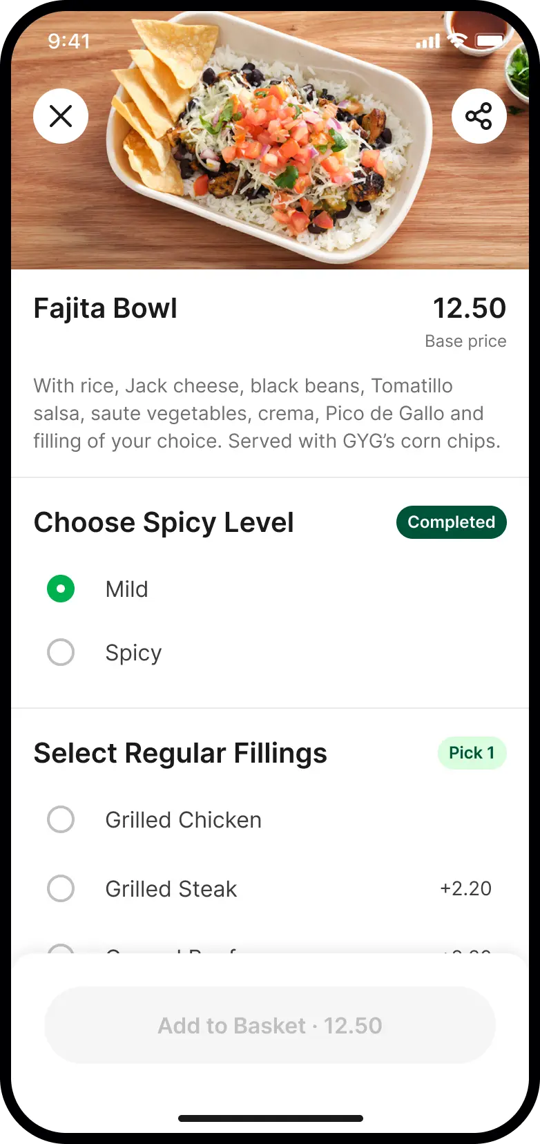
• Bringing food higher into the experience to encourage earlier discovery and basket building.
Rather than designing each feature independently, the page became a coordinated system where every component served a clear purpose.

Outcomes
The redesigned menu improved both customer decision-making and business performance across one of GrabFood's highest-traffic surfaces.
Customer Impact
• Improved Food Menu → Basket Rate (+0.016pp)
• Improved Basket → Checkout Rate (+0.018pp)
• Clearer discovery of restaurant offerings and menu items
• Reduced friction during ordering and item modifications
Business Impact
• Food Session CVR (+0.012pp)
• GMV per Pax (+2.42%)
• Group Order CTR increased to (+88%)
• GrabUnlimited Subscriptions (+2.4%)
see all projects

GrabFood Day XUSER EXPERIENCE • SYSTEMS DESIGN
Grab Food HomeUser Experience

SideChef GroceryEnd-To-End Product

Okay ReadsPersonal Project

SideChef Meal PlannerEnd-to-End Product

SideChef 4.0 Brand IdentityBrand and Identity
Mouu CliqUser Experience

Ambi ClimateUser Experience